By Soham Kamani
Think of how long it takes to book a ride home from work. Every user has to go from the same place to the same destination, at approximately the same time, and yet, one has to supply the same information everyday to order a cab. As an org that has as a strong emphasis on automation, this manual task was something we wanted to do away with.
Every user has these inherent traits. Some order Martabaks every alternate day, some love pizzas on Fridays, others love massages on Saturdays, some prefer a beautician on alternate Sundays. What if we can customise this experience for each user based on their tastes and preferences? We’re offering a more personal ‘experience’ to a GO-JEK user. With this thought process in mind, we got to work and…
About a month back, with GO-JEK v2.34, we released a personalization engine to ensure every user’s page is unique and tailor made based on individual preferences and taste. Obviously, tailoring the homepage for our millions of users comes with its own set of problems. It’s still a WIP, but the big picture is to hyper-personalise the app for every user.
This is the story of how we went about iterating and ultimately, launching ‘Project Shuffle’ — where every user gets their own set of personalized “cards”, which can be anything from a quick navigation for a GO-RIDE home, or grab a discount offer from GO-FOOD.
Why Shuffle?
A few months back, we realized that the way other apps think of their user experience is somewhat flawed. Most apps try to optimize their experience for “the user”. The problem with this approach is the singular term. In reality, we have many different users, and each is unique in how they use the app. So far, we’ve tried to generalize our app so the average user gets the best possible experience.
But… GO-JEK’s core is radically different: we have foodtech, fintech, logistics, payments all baked into one Super App. This results in a huge variation with respect to the way any two people use our app.
For example, I know of a friend I met in Jakarta who used the app primarily to order groceries using GO-SHOP. At the time, I was using GO-JEK to order rides to and from my office. Another driver I spoke to used the app to order his favorite meal at least 3 times every week. It’s almost like we were using entirely different apps!
We needed something to tie all our services together and unify them into one experience. So we put the best minds to it. After 2 months, and less than 10 engineers, we finally released Project Shuffle.
Here’s what the home screen looks like with Shuffle enabled:
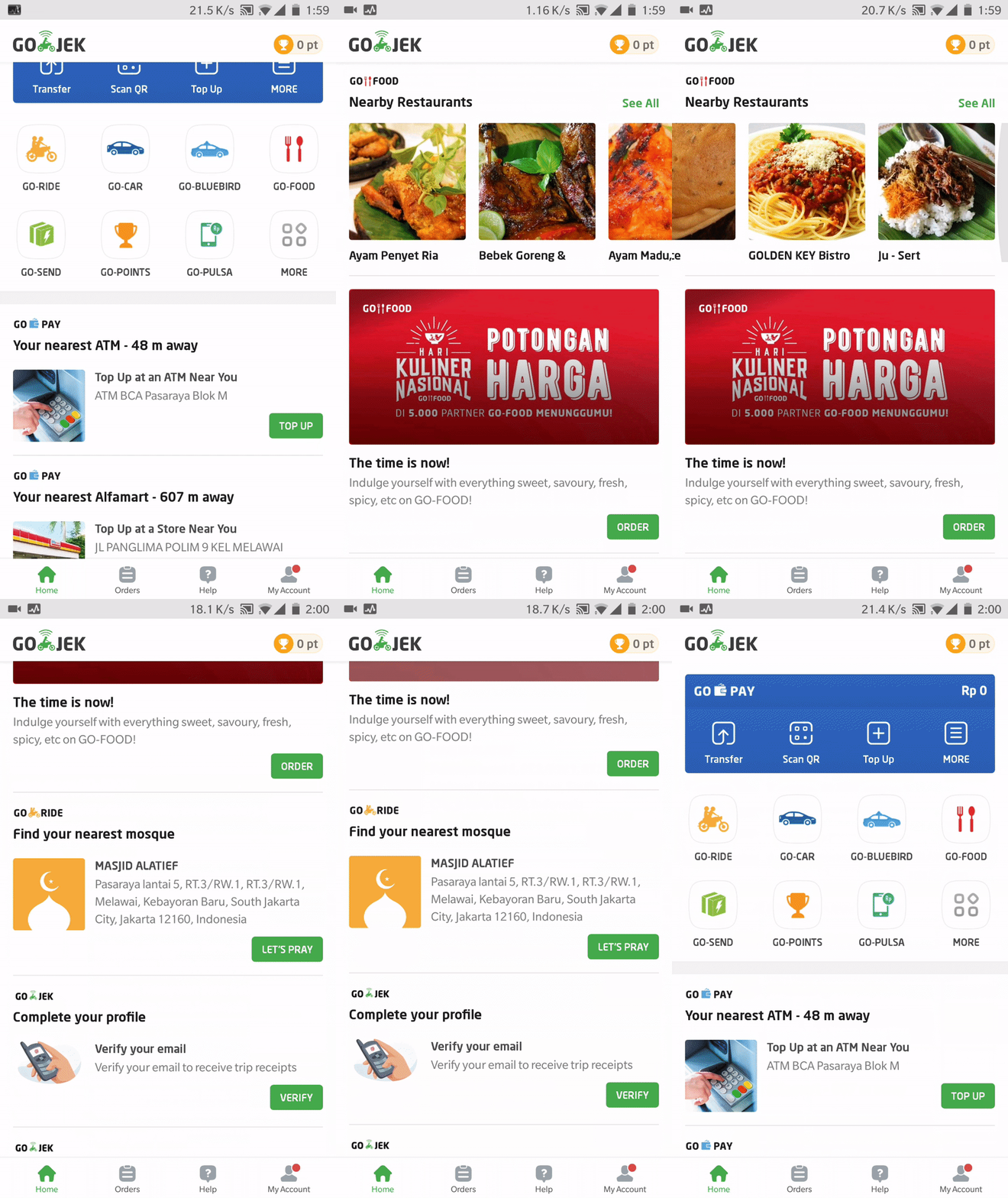
Project Shuffle allows us to lift the illusion of the “average user” and cater to different kinds of to whom we can send custom cards for:
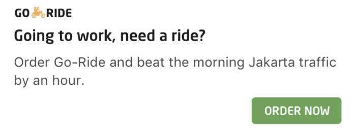
- Booking a ride on most frequent routes
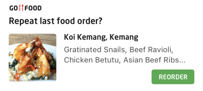
- Re-ordering a favorite dish on GO-FOOD
- Seeing new movie releases on GO-TIX
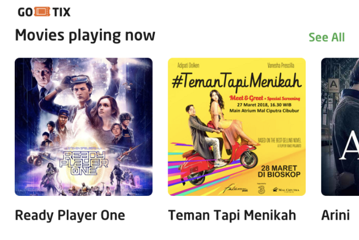
…all in a single click. (Well, two. If you consider opening the app a click 😉)
Another benefit — we can now inform users about promotions and services which they might entirely miss out on. For example, we sent out a bunch of cards with special offers, and wishes, during the period of Ramadan. So instead of just the splash screen changing, the entire app changes according to the occasion.
Scaling challenges
In order to implement Project Shuffle to accommodate our scale, we had to consider the following:
- How do we ensure all users get their own cards with a reasonable SLA? There may well be a whole bunch of cards we would want to show. If we were to wait for all cards before we display them to the user, we would be limiting ourselves before the slowest card appears.
- How do we scale across our many services? Since GO-JEK is more like a bunch of apps within a larger app, we not only need to scale vertically (for each of our users), but also horizontally (across our services), since each service would have their own card to show to the user.
We also faced challenges in developing Project Shuffle as a platform, rather than just as a service:
- How can we ensure a consistent format for the cards shown to the user? Building on the previous point, we had to ensure each card has its own unique content while keeping the UI clean and consistent.
- How can the card providing services be developed independently of the system? This meant it should be easy to develop and deploy services that could deliver their own cards to the user.
- How can we rank all cards coming from different services? Comparing the value of taking a GO-RIDE, to ordering food on GO-FOOD, is like comparing apples to oranges… or is it?
These challenges led us to an entirely new architecture which I will explain in the next post.
What the future holds
Shuffle has been an ambitious project, and we’ve only scratched the surface. There’s still a lot to be done, and much to improve. With the potential to change each users’ home screen according to what’s best for them, the possibilities are virtually endless.
With GO-JEK the only Super App in Indonesia, we want to make sure all our users can get everything they need to do their daily activities without ever leaving the app. Project shuffle takes this ambition closer to being a reality.
We are always looking for new and innovative ways to make cards on the home screen more engaging, and rank the cards to better fit what the user actually needs. Have any suggestions on how we can take this to the next level? Let us know in the comments, or better yet, join us! Check out gojek.jobs for more.

