By Megha Goyal
You’re reading Part-2 of a two-part series documenting the evolution of GoFood’s ordering flow.
The story so far: When GoFood was launched in 2015, it was a concierge model with no tie-ups with restaurants. Orders were piling up and we needed a dependable model to lean back on. GoFood’s order flow underwent three phases of iterations before we landed on the final one.
ICYMI, here’s Part-1 of the story:
We were scaling exponentially and this required a seamless ordering flow.
After thorough discussions and brainstorming, we arrived at Merchant Accept Flow (MAF). We, as creators of MAF, were ready for the concept to be implemented. But our users… not so much.
You see, with 2 categories of merchants (partners and non-partners) already a part of our ecosystem, we were all set to introduce a third one, along with a whole new order flow. And to top it all, MAF isn’t a term that our customers would always be able to recall.
Continuing our affinity towards fancy nomenclature, we decided to name the newest category of merchants, “Super Partners”.
To test out the new ordering flow, we rolled out a basic design to a few of our users. Super Partners were a subset of GoFood Partners, so for the pilot, we simply added an additional identification to our existing design.
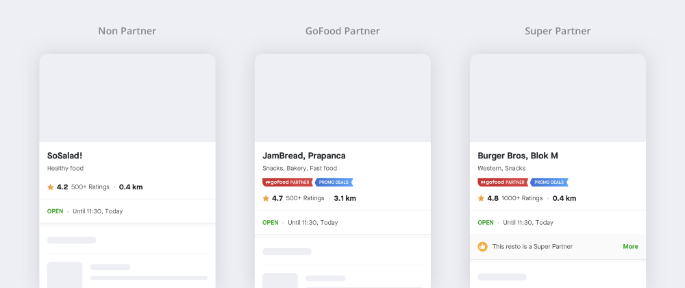
We wanted to get an overview of our users’ understanding about our different partner types.
Were they understanding the difference?
Did it even matter to them?
We started tracking user behaviour on the merchant badges and simultaneously conducted a research to get answers to these questions.
Research insights on GoFood Partners
The participants who were a part of the research had heard about GoFood Partners (thanks to posters in restaurants, social media, banner on GoFood home screen, etc.), but had little knowledge of what they meant.
When asked to take a guess about what they thought “GoFood Partner” meant, the answers were… diverse!
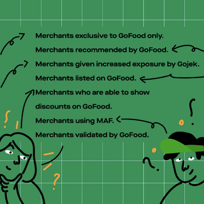
This was an indication that customers had little knowledge about the different types of partners who were continuously making their GoFood experience better.
Problem #1
Research insights on Super Partners
Some participants of the research were aware of MAF because of push notifications they’d receive, but couldn’t identify who Super Partners were.

The general assumption about Super Partners were:
- Assurance that there won’t be merchant-related cancellation (merchant closed, out of stock item) because order is confirmed by merchant.
- Order would be quicker to complete because the restaurant would start preparing the food before the driver arrived.
- Driver partners wouldn’t have to wait after arriving to pick up the order
After we explained what being a Super Partner actually meant and the benefits that users could entail, they began associating Super Partners with:
Convenience
- No communication required with the driver.
- No need to stay active on the phone after ordering.
Assurance
- No merchant/driver related cancellations.
- Happy that the merchant gets to accept the order directly.
Time Efficiency
- Faster ordering time since merchants prepare food beforehand.
Despite this improved understanding, there was a constant apprehension on the users’ side if the merchants would actually start preparing food instantly.
Problem #2
Action items from the research
Now that we understood what our users’ pain points were, we had to do the following:
- Make merchant type education more discoverable.
- Assure users that Super Partners were going to begin food preparation instantly upon confirming orders.
After the field run, it was time to turn back to our whiteboards and do what we’re happiest doing — ideating and executing!
Using Recall as a design approach
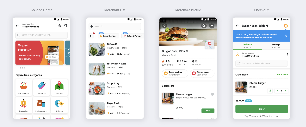
The idea was to introduce Super Partners to users at the very moment they opened the GoFood home and make them recall the icon on Merchant List as well as Merchant Profile.
The Super Partner icon would be tappable on most screens, giving in-depth detail about Super Partners via a Dialog Card.
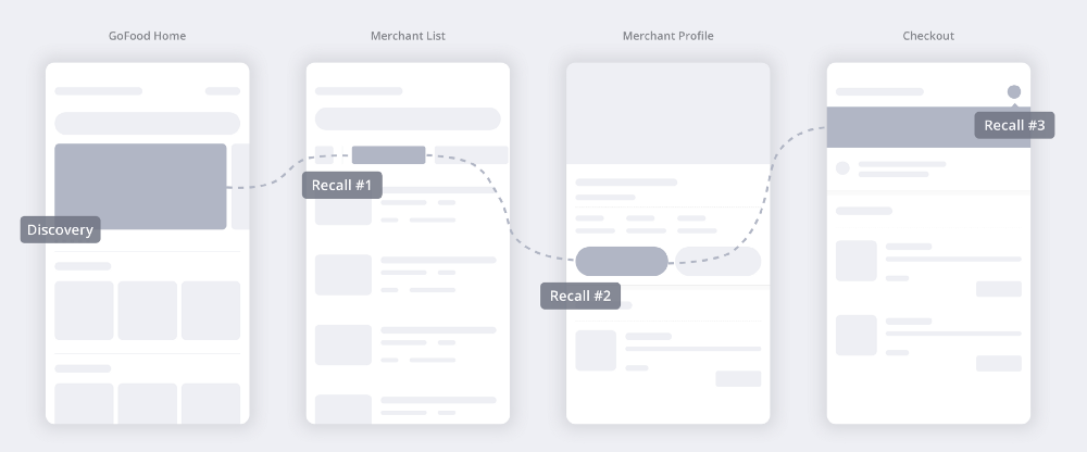
Here are all the Super Partner recalls we decided to nudge:
- User first discovers Super Partner on GoFood home.
- First recall happens on Merchant List.
- Second recall happens on the Merchant profile page.
- Third recall happens on the checkout page.
We created high fidelity prototypes for these screens and tested them with our users.
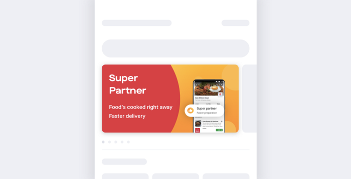
GoFood Home
A Super Partner banner was added on the screen and our users’ behaviour towards this was tested. Most of our participants read the banner and perceived the right benefits of Super Partners.
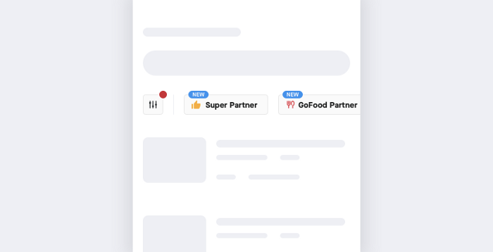
Merchant List
To simplify the filtering process for our customers, we added quick filters that showed partner types on our merchant list screen.
Merchant Profile
We added a dedicated Super Partner badge on merchant profile.
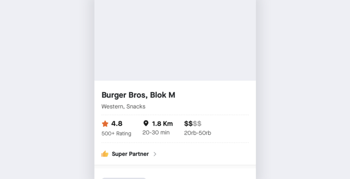
But it seemed like our research participants barely noticed these changes, because they’d still constantly wonder what else a Super Partner would do.
So we added another line of text, highlighting the uniqueness of the merchant. To make the badge intuitively clickable, we added a boundary around it along with a chevron.
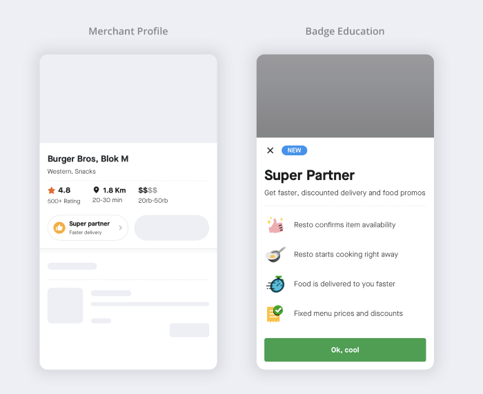
With this design, all our participants perceived the clickability of the Super Partner badge, and understood that the merchant would deliver food faster.
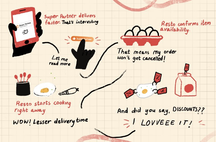
Our customers loved it, so did we! But…
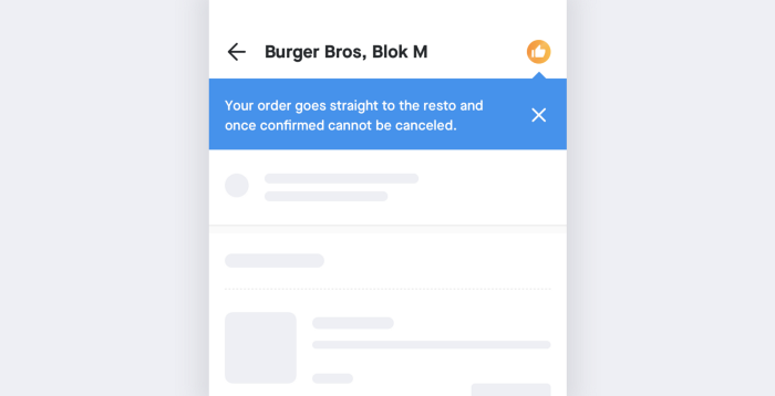
Yes, you got it right, there was still a problem. Since the merchant would start preparing food on acceptance, we did not want to encourage customer-side cancellations too. And we had to inform our users about this.
Checkout Screen
We wanted to be as transparent as possible with our customers. So an extra nudge was added on the checkout screen that would remind them to double check their orders and reiterated the no-cancellation-policy after the merchant accepts the order.
Active Order Screen
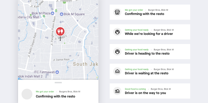
The status updates in the active order screen were used to convey the new flow more flawlessly.
Where we stand now
Things on the MAF front have been looking good. It was an insightful experience building a robust ordering flow that helps our entire ecosystem of users: Customers, Driver Partners and Merchant Partners alike!
Like all good product stories, this is not the end; only a pause. We are still learning and improving. As the product scales more, there are bound to be new challenges, which we hope to tackle in a way that supports our users best.

